📊 Complete Documentation
Time Intelligence Bar Chart for Microsoft Power BI
Master every feature with step-by-step guides and real-world examples
Version 1.0.0 | September 2026📖 Introduction
Time Intelligence Bar Chart is a free custom visual for Microsoft Power BI that helps you analyze time-based trends and compare performance across periods. No subscription, license key, or paid upgrade is required.
Automatically aggregate and analyze data by Day, Week, Month, Quarter, or Year with a single click.
Compare periods sequentially or positionally with intelligent previous period matching.
Five dynamic dropdowns let users explore data by year, quarter, and month without slicer clutter.
Intelligent narrative showing highest, lowest, totals, and overall trends at a glance.
Complete control over colors, styles, labels, legends, animations, and more.
Keyboard navigation, screen reader support, and high-contrast compatibility.
Who Should Use This Visual?
- Finance Teams: Revenue trending, budget vs. actual, variance analysis
- HR Analytics: Headcount tracking, hiring trends, turnover analysis
- Sales Performance: Period-over-period sales, quota tracking, territory comparison
- Operations: Production metrics, efficiency tracking, capacity planning
- Marketing: Campaign performance, lead generation, ROI tracking
- Executive Dashboards: High-level KPI tracking with drill-down capability
📥 Installation
Method 1: Install from Microsoft AppSource (Recommended)
Launch Microsoft Power BI Desktop on your computer.
Look for the Visualizations pane on the right side of your screen.
Click the three dots (…) icon at the top of the Visualizations pane, then select Get more visuals.
Type Time Intelligence Bar Chart in the AppSource search box.
Click Add on the visual listing. The visual icon appears in the Visualizations pane.
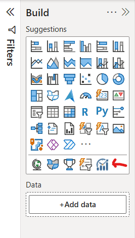
Visualizations pane with the Time Intelligence visual installed and ready to use.
Method 2: Import from File (.pbiviz)
- Download the
.pbivizfile from the source - In Power BI Desktop, open Visualizations → … → Import a visual from a file
- Browse to the file and select it
- Click OK when the security warning appears
- The visual icon appears in the Visualizations pane
Power BI Service (Cloud)
Once installed from AppSource in Power BI Desktop, the visual works automatically in Power BI Service when you publish the report.
🚀 Quick Start Guide (5 Minutes)
Get your first time intelligence chart running in minutes.
Step 1: Add the Visual to Your Report
In the Visualizations pane, click the Time Intelligence Bar Chart icon.
Step 2: Add Your Data
Drag a Date or DateTime column to the Date field well.
Example: OrderDate, TransactionDate, HireDate
Drag a numeric measure to the Values field well.
Examples: Sales, Revenue, Quantity, Headcount
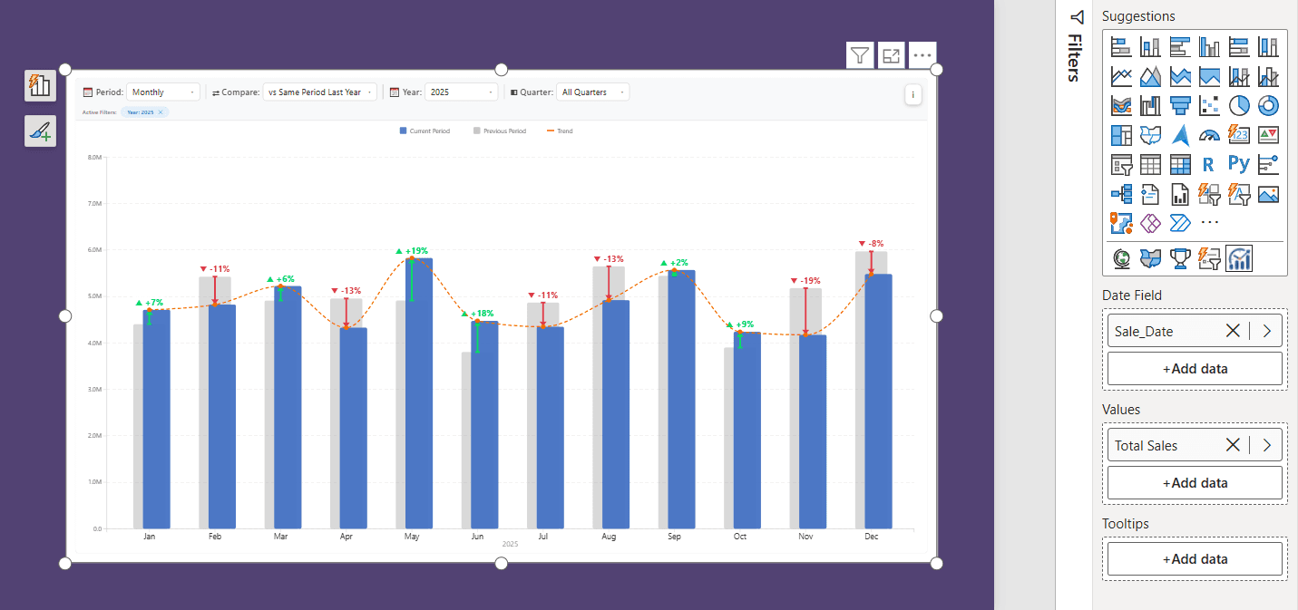
Field wells populated with a Date field and a numeric measure before the chart renders.
Step 3: Configure Time Period
Use the control bar to choose:
- Daily: one bar per day
- Weekly: one bar per week
- Monthly: one bar per month
- Quarterly: one bar per quarter
- Yearly: one bar per year
- YTD: year-to-date cumulative values
Step 4: Add Comparison (Optional)
Pick a comparison mode such as:
- vs Previous Period
- vs Same Period Last Year
The visual renders previous-period bars alongside the current period for easy comparison.
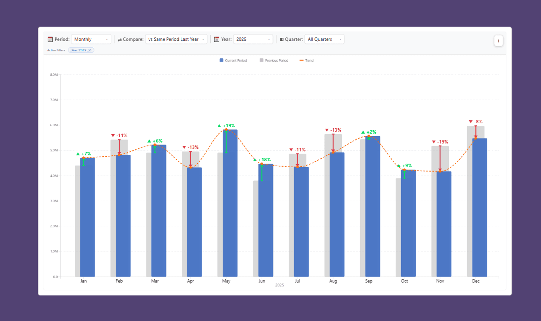
Chart output with comparison bars showing current and previous period performance.
Step 5: Filter by Year / Quarter / Month
Use the additional dropdowns to focus on selected time windows:
- Year: All Years or a single year
- Quarter: Q1-Q4
- Month: Jan-Dec
📊 Data Requirements
| Field Well | Type | Required | Max Count | Description |
|---|---|---|---|---|
| Date | Date/DateTime | ✅ Yes | 1 | Main grouping field for period analysis |
| Values | Numeric | ✅ Yes | 1-5 | Primary measure shown in chart |
| Tooltips | Any | ❌ Optional | 0-5 | Extra columns surfaced in hover tooltips |
Date Field Requirements
✅ Supported
- Date column
- DateTime column
- Standard date dimension tables
❌ Not Recommended
- Text values like "January 2026"
- Numeric date IDs instead of a real date column
- Hierarchies instead of base date fields
Sample Data Structure
OrderDate | Sales | Region | Product 2026-01-01 | 1500.00 | East | Widget A 2026-01-02 | 1750.00 | East | Widget A 2026-02-01 | 2300.00 | West | Widget BRecommended mapping:
- Date:
OrderDate - Values:
SUM(Sales) - Tooltips:
Region,Product
⚙️ Basic Setup
After adding data, configure the essential format-pane settings to make the visual clear and purposeful.
Control Bar / Filters
Choose the time grouping that appears when the visual first loads.
Use previous-period comparison for quick trend analysis.
Period Summary
Toggle the narrative summary above the chart.
Data Labels
Toggle value labels on the bars when needed.
🎛️ Control Bar & Dynamic Filters
The control bar provides five interactive dropdown filters that help users explore data without adding slicers to the report.
The 5 Dropdowns Explained
| Filter | Purpose | Example |
|---|---|---|
| Period | Choose Daily, Weekly, Monthly, Quarterly, Yearly, or YTD | Monthly |
| Comparison | Compare against previous period or same period last year | vs Previous Period |
| Year | Focus on a specific year | 2026 |
| Quarter | Filter within a year | Q2 |
| Month | Focus within a quarter | May |
📅 Time Periods
Daily
One bar per day. Best for detail-level trend monitoring.
Weekly
One bar per week. Useful for removing daily noise and seeing patterns.
Monthly
One bar per month. This is often the default option for business reporting.
Quarterly
One bar per quarter. Ideal for executive summaries and strategic reviews.
Yearly
One bar per year. Useful for long-term growth and trend evaluation.
YTD
Year-to-date cumulative values. Great for tracking progress toward annual targets.
⇄ Comparison Modes
The visual supports period comparisons to help answer questions like “how did we do compared with the last period?”
- No Comparison: current period only
- Previous Period: each period compared to the immediate prior period
- Same Period Last Year: each period compared to the same point in the previous year
This makes the chart useful for month-over-month, quarter-over-quarter, and year-over-year analysis.
📊 Chart Types & Styles
Use the chart type options to switch between clustered column and clustered bar views.
- Column Chart: vertical comparison view
- Bar Chart: horizontal comparison view
- Side by Side: compared bars shown adjacent
- Overlapped: bars layered together
- Behind (Ghost): previous period bars appear behind the current bars
Spacing, overlap, and bar radius are all configurable in the format pane.
📈 Period Summary
The period summary sits above the chart and gives a short narrative based on the currently selected data window.
- Top period / lowest period
- Total value
- Average value
- Change vs previous period
- Contextual trend callout
This is useful for executive dashboards where the chart needs context, not just raw bars.
🏷️ Data Labels
Turn on labels to show actual values on the bars or above them.
- Display value labels
- Control decimal precision
- Adjust font size and placement
- Match label styles to your report theme
📐 Axes Configuration
Format the chart axis to improve readability and align with your report design.
- Axis title visibility
- Tick label formatting
- Display units
- Gridline control
- Label color and font settings
🎨 Colors & Styling
The visual supports detailed styling for current bars, previous bars, gridlines, background, labels, and summary text.
- Bar color palette
- Previous period styling
- Background transparency
- Gridline colors
- Axis and label color control
📏 Error Bars
If you are using measure uncertainty or variability, the visual can render error bars to indicate ranges.
- Enable or disable error bars
- Adjust error bar color
- Use error range for forecast or variance-based analytics
📉 Trend Lines
Trend lines can help show direction and pattern in long-running time series.
- Guide the eye with a line of direction
- Use on performance, growth, or volume analysis
- Improve readability in dense time-series visuals
🧭 Legend
The legend helps explain the visual meaning of the current and previous-period bars and any comparison context.
- Toggle legend visibility
- Adjust legend position
- Use color mapping to clearly identify the current series
💬 Tooltips
Hover tooltips provide context-rich insight for each period value and comparison.
- Current value
- Previous value
- Percentage change
- Additional supporting field values
⚡ Animation
Animations improve chart transitions, but they can be disabled for large datasets to preserve performance.
- Toggle animations on/off
- Set animation duration
- Auto-disable on large data volumes for performance safety
🧠 Time Intelligence
The visual is built around time intelligence logic: it understands period flows, year boundaries, quarter cutoffs, and historical comparison windows.
- Monthly, quarterly, yearly, and YTD grouping
- Current vs previous period logic
- Comparison against same period previous year
- Aligned districting of bars based on filters
🔗 Cross-Filtering
When used with other visuals in the same report, the chart can participate in cross-filtering and selection interactions.
- Click a bar to select it
- Use report interactions for filtering
- Retain a clean and interactive dashboard experience
🔎 Drill-Through
The visual supports meaningful time-based exploration and is well-suited for drill-through and dashboard navigation patterns.
- Filter by time context
- Explore specific periods
- Deep-dive into a selected point in a larger executive dashboard
♿ Accessibility
The visual includes built-in accessibility support to make it useful and readable in enterprise reporting environments.
- Keyboard support and focus states
- High contrast compatibility
- Readable labels and summary text
- Custom tooltip support for context
💼 Real-World Use Cases
Use Case 1: Revenue Tracking
Business Need: Monitor monthly sales against last month and last year.
Configuration: Monthly period, previous-period comparison, label visibility on, summary enabled.
Use Case 2: Staffing & Hiring
Business Need: Understand hiring volume via weekly and quarterly trend reporting.
Configuration: Weekly period, Q2 filtering, comparison enabled, tooltips showing department context.
Use Case 3: Executive KPI Scorecards
Business Need: Keep a clear leadership view of revenue, productivity, or operational output.
Configuration: Quarterly or yearly view, summary narrative visible, no clutter, simple color styling.
✨ Best Practices
- Use a proper Date table if your data spans multiple years.
- Keep the date column as a real Power BI Date type.
- Pre-aggregate large datasets when performance is a concern.
- Use meaningful comparison logic and keep labels readable.
- Use summary text for executive readability and clean story flow.
🔧 Troubleshooting
Issue: Visual shows no data
- Check that both Date and Value fields are populated.
- Clear active filters to make sure data is not being narrowed out.
- Confirm the date column is actually typed as Date.
Issue: Wrong comparison being shown
- Check the selected comparison mode in the control bar.
- Review the selected year or quarter filters.
- Ensure the date range has enough periods for comparison logic.
Issue: Chart feels cramped
- Increase the visual size.
- Reduce bar spacing or overlap percentage.
- Turn off labels if the chart is dense.